Charting 101: If I Knew Then What I Know Now
Vice President & Senior Editor
I remember my first encounter with a stock chart. We are talking years back, in the early to mid 2000s. I had received a tip from a “buddy” to buy a certain junior mining stock. The tip had all the usual ingredients to get my heart pounding and my wallet emptied. Promises of the next great gold mine, 100% upside from here, “your still early” comments etc etc. I could barely contain the excitement as I gathered funds to buy the sure thing! The urgency that my buddy had instilled in me was dangerous, I didn't even know the full name of the company when I entered the symbol in my discount brokerage search function to buy it. Once I saw the name I remember thinking, with a name like that how can i lose? Well spoiler alert. I lost. I lost almost my entire investment. Of course at the time I blamed the macro environment or collapse of the price of gold but I didn't even realize I had access to a valuable tool that would have kept me from pulling the trigger on the purchase. Looking back at the chart, I was buying on the edge of a cliff, a crazy move but my excitement had taken over all my senses. I had fallen for the oldest trick in the book, buying the top.
Reading a stock chart for the first time can feel like trying to decipher a different language. Parts of it feel familiar and in English but parts might as well be in ancient Egyptian hieroglyphs. Once you understand the basics of price action, charting can be a powerful tool in your investor arsenal.
The Basics: Price and Time
A stock chart is a two-dimensional plot of points with a vertical and horizontal axis. The vertical axis represents the price of the asset, and the horizontal axis represents the time interval (minutes, days, weeks, or years). Every data point on that chart tells you exactly what the market was willing to pay at a specific moment in time. Recognizing patterns and trying to predict future movements from these charts is known as technical analysis. Charting and recognizing patterns can certainly help investing in many scenarios but it's also important to grasp the whole picture of a trade. For example a stock that is going bankrupt could bounce and trigger a short term buy opportunity on the chart but likely will still go bankrupt and continue to head to $0.
Line Charts
The line chart is the simplest form of technical analysis. It connects a series of data points, usually just the daily closing prices, with a continuous line.
Pros: It filters out the noise of intra-day volatility, making it easy to spot the primary trend.
Cons: It lacks detail. You can't see how high or low the price went during the day, you can only see where it ended.
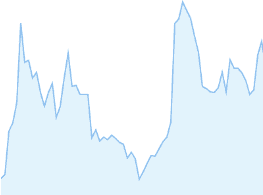
Simple Line Chart
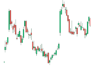
Bar Charts (OHLC)
Bar charts provide more context by showing the Open, High, Low, and Close (OHLC) for a specific period.
The Vertical Line: The top represents the highest price hit; the bottom is the lowest.
The Left Horizontal Dash: Represents the opening price.
The Right Horizontal Dash: Represents the closing price.
Bar Chart
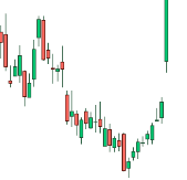
Candlestick Charts
Developed by Japanese rice traders in the 1700s, candlesticks are the most popular tool for modern traders because they offer market sentiment within a few second glance.
The Body: The thick part of the candle represents the range between the open and close.
The Wicks: The thin lines sticking out of the top and bottom show the price extremes (Highs and Lows of the time period, usually daily).
Color Coding: Generally, a green (or white) candle means the price closed higher than it opened (Bullish). A red (or black) candle means it closed lower (Bearish).
Candlestick Chart
Support and Resistance: The Floor and Ceiling
Before examining charts and looking for patterns that can dictate stock price direction, you must understand the two invisible boundaries that govern most charts:
Support: A price level where a downtrend tends to pause due to a concentration of demand (buying power). Think of it as a floor.
Resistance: A price level where an uptrend tends to pause due to a concentration of supply (selling power). Think of it as a ceiling.
Reading the Chart: Bullish Patterns (Signs to Buy)
Bullish patterns suggest that the buyers (the "Bulls") are taking control and the price is likely to head higher. Identifying these patterns early and making sure they are confirmed are key before investing. Always look for large volume (the number of shares traded) to confirm a move for both bullish and bearish trends on the chart, a price breakout on low volume is often a fake breakout, while a breakout on high volume suggests the move could be real.
The Double Bottom (‘W’) Pattern
This occurs when a stock hits a low point, bounces, drops back to that same low point, and bounces again. It resembles a ‘W” as seen in the graphic below. It signals that the stock has found a hard floor, sellers are exhausted and buyers are taking over again. This simple chart pattern can be a powerful tool to help spot upside potential.
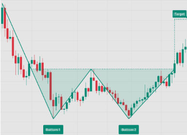
Double Bottom Pattern
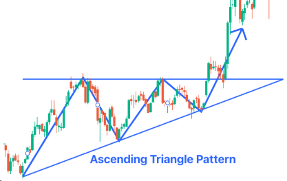
The Ascending Triangle
This pattern features a flat upper resistance line and a rising lower support line (as seen below). It suggests that while sellers are holding a specific price, buyers are becoming more aggressive and pushing higher lows until the price breaks through the ceiling. An ascending triangle is a favorite pattern to recognize as it can help spot a breakout to the upside.
Reading the Chart: Bearish Patterns (Signs to Sell)
Bearish patterns suggest that the sellers or ‘bears’ are winning the stock price tug-of-war, and a price drop may be imminent. Spotting bearish patterns can allow you to sell shares you already own before they fall in price. Alternatively you can sell the stock short and profit from the downside slide in share price. Shorting stocks is a risky venture and only experienced traders should attempt it.
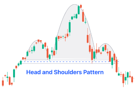
Head and Shoulders
This is one of the most reliable reversal patterns. It consists of a peak (shoulder), followed by a higher peak (head), and then another lower peak (shoulder). A break below the "neckline" (the support level connecting the lows) usually signals a major trend reversal to the downside. A head and shoulder top is an excellent time to sell your shares before things get worse.
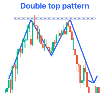
The Double Top (‘M’) Pattern
The inverse of the Double Bottom. The price hits a high, retreats, tries to hit that high again but fails, and falls. It indicates the "ceiling" is too strong for the buyers to break. The double top pattern is a great way to limit downside risk. Once the second attempt to breakout is determined to be futile and confirmed on the chart, selling your shares can save you from further downside.
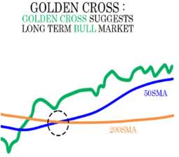
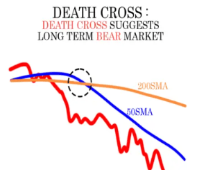
Moving Averages
Moving averages are lines drawn on a chart to identify the direction or trend of the price action. Moving averages simplify the chart so investors are not distracted with short term volatility. They calculate the average price over a specific number of days to create the trend lines. There are two very important moving average trends to look out for as seen below:
The Golden Cross: When a short-term moving average (e.g., 50-day) crosses above a long-term moving average (e.g., 200-day). This is a strong bullish signal.
The Death Cross: When a short-term moving average crosses below a long-term moving average. This is a strong bearish signal.
Charts Are One of Many Valuable Tools
Charts are a map of the past with only a vague idea of the future. They are snapshots that may work out beautifully one time and not the next time. They show you where the price has been and where the path of least resistance forward currently lies. There are but only one tool of many to predict price performance and should be used with other tools in your tool belt to help predict price moves. This article has only scratched the surface on Technical Analysis and charting, stay tuned for many more articles to come with greater detail into the most widely used and useful technical analysis techniques.
Disclaimer: This newsletter is for informational purposes only and does not constitute financial advice. Investing in junior mining companies involves significant risk.